Overview
ThinkingData is a global gaming analytics company offering data platforms for actionable player insights.
In 2023, the product entered a major 4.0 redesign, I took ownership of the entire data visualization overhaul.
Problems with the old version
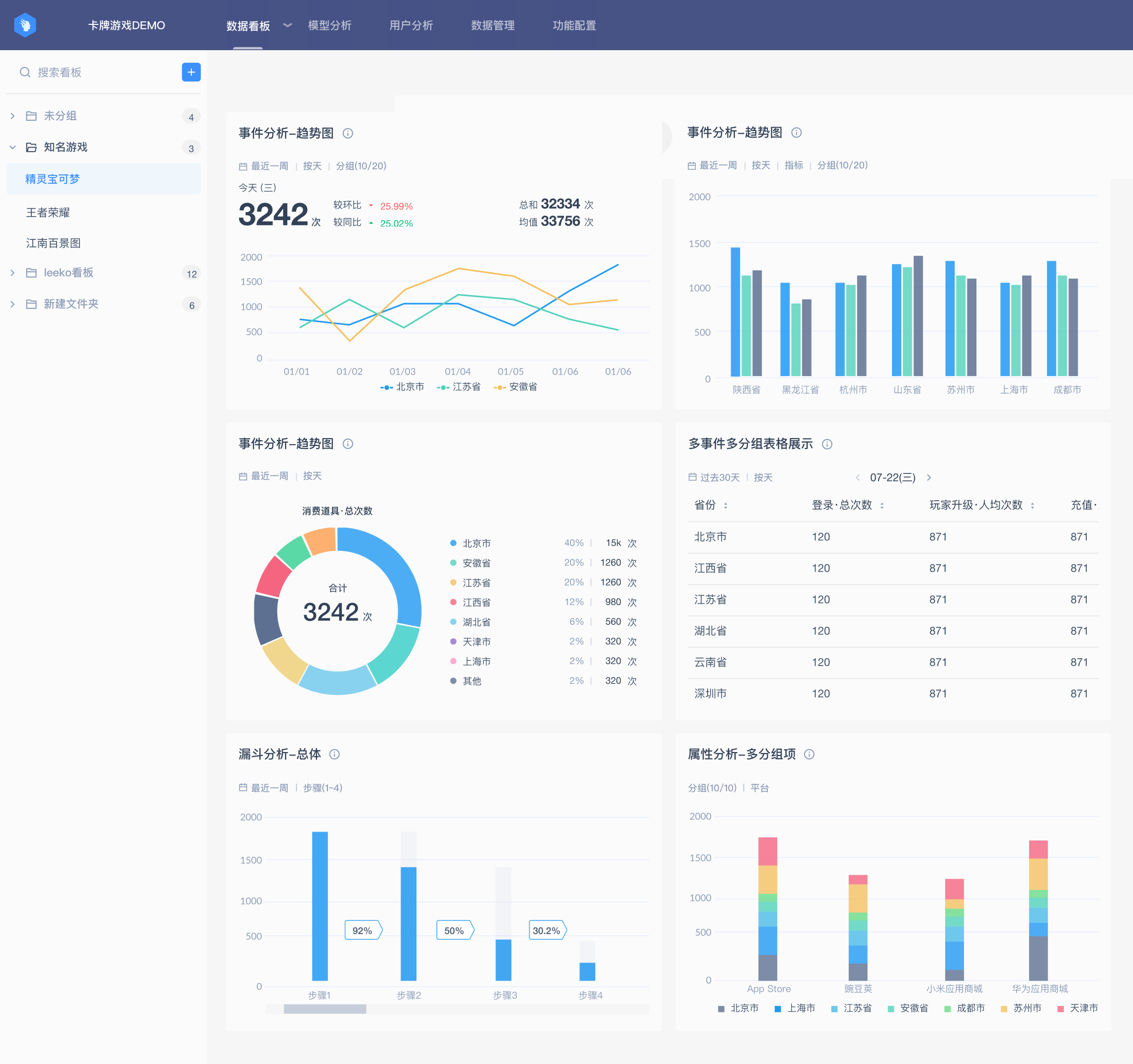
Before the 4.0 redesign, the team did not have a dedicated designer managing data visualization standards. Based on user feedback and a full audit of the existing dashboards, I identified several key issues:
Lack of visualization guidelines
Documentation was partial and unsystematic, leading to inconsistent chart usage, colors, and layouts.
Insufficient support for advanced analysis
Basic chart types were available, but advanced visualization options were missing for complex analysis.
Weak visual emphasis
Low color saturation and contrast made key trends harder to identify and caused visual fatigue over time.
Poor text readability
Text contrast on colored backgrounds, such as heatmaps, did not meet readability standards.
Design goals
Drawing from these insights, I established clear goals to guide the new data visualization design.
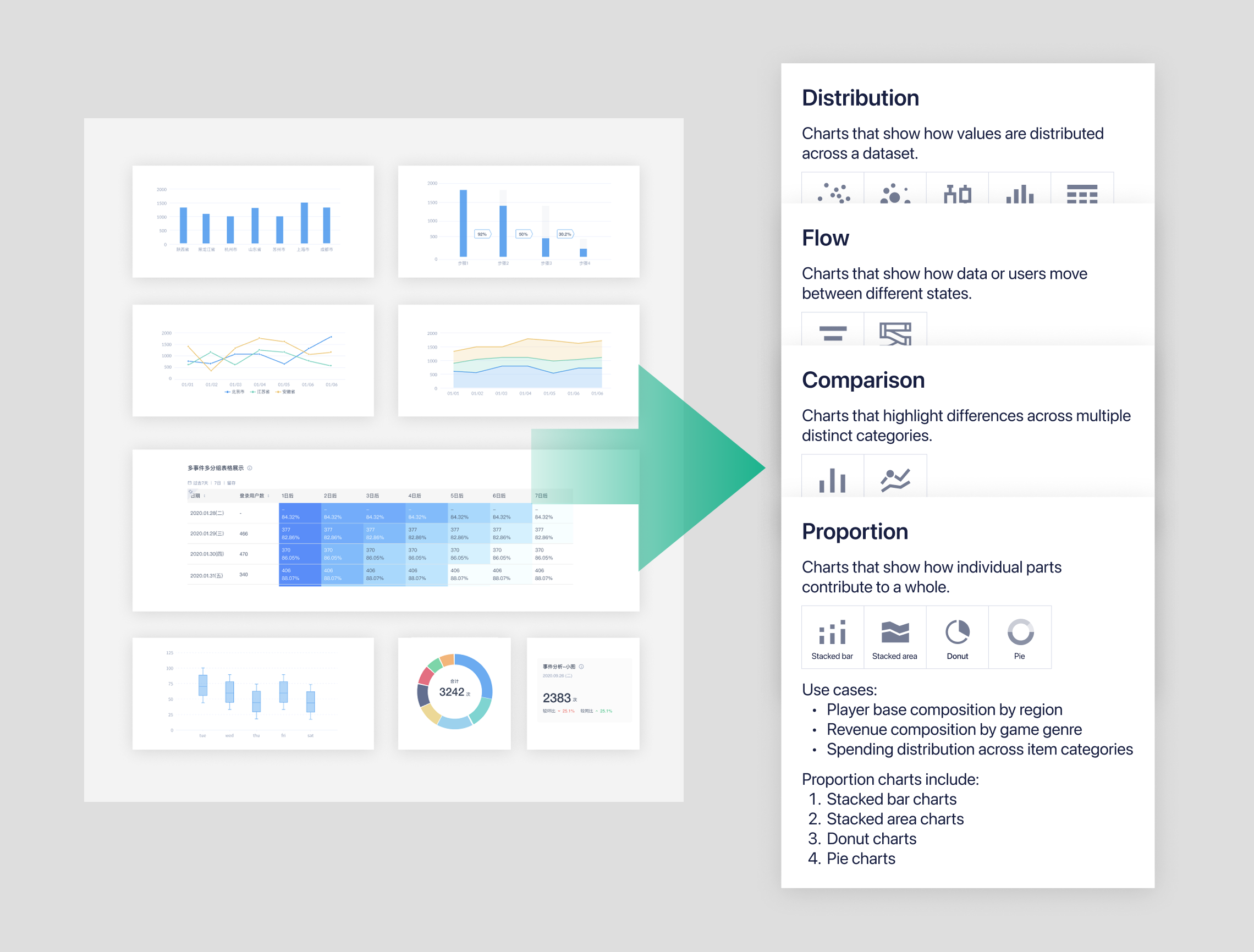
Unified and scalable visualization standards
Build consistent guidelines for chart usage, colors, layouts, and best practices.
Support advanced analysis
Add advanced chart types such as bubble and scatter charts to support complex workflows.
Improve visual clarity
Increase color contrast and strengthen visual hierarchy to reduce cognitive load.
Enhance readability and accessibility
Improve text contrast, especially in color-heavy charts like heatmaps.
Design process
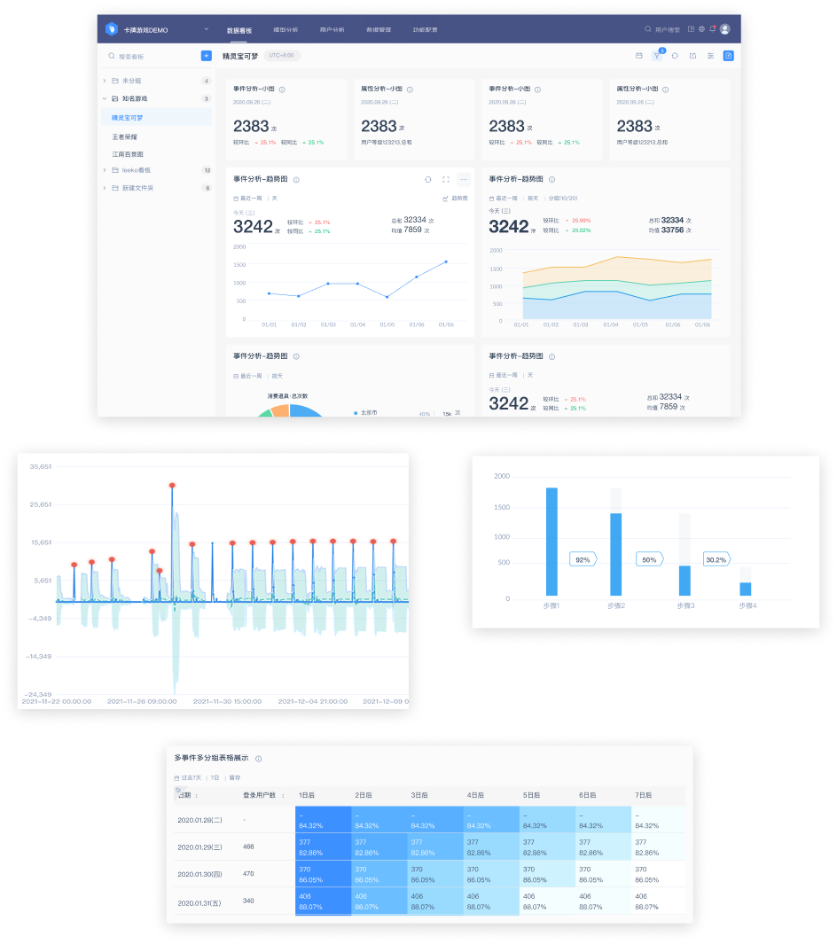
I began by conducting a comprehensive audit of all existing dashboards, combined with user feedback from operations and data teams. This helped identify inconsistencies, visual fatigue, missing chart types, and readability issues.
Design principles
Based on the findings from the audit, I established a set of core principles to guide all redesign decisions. These principles focused on Accurate, Clarity, Helpful.
Accurate
Ensure accuracy, clarity, and integrity in how data is presented, avoiding any form of distortion.
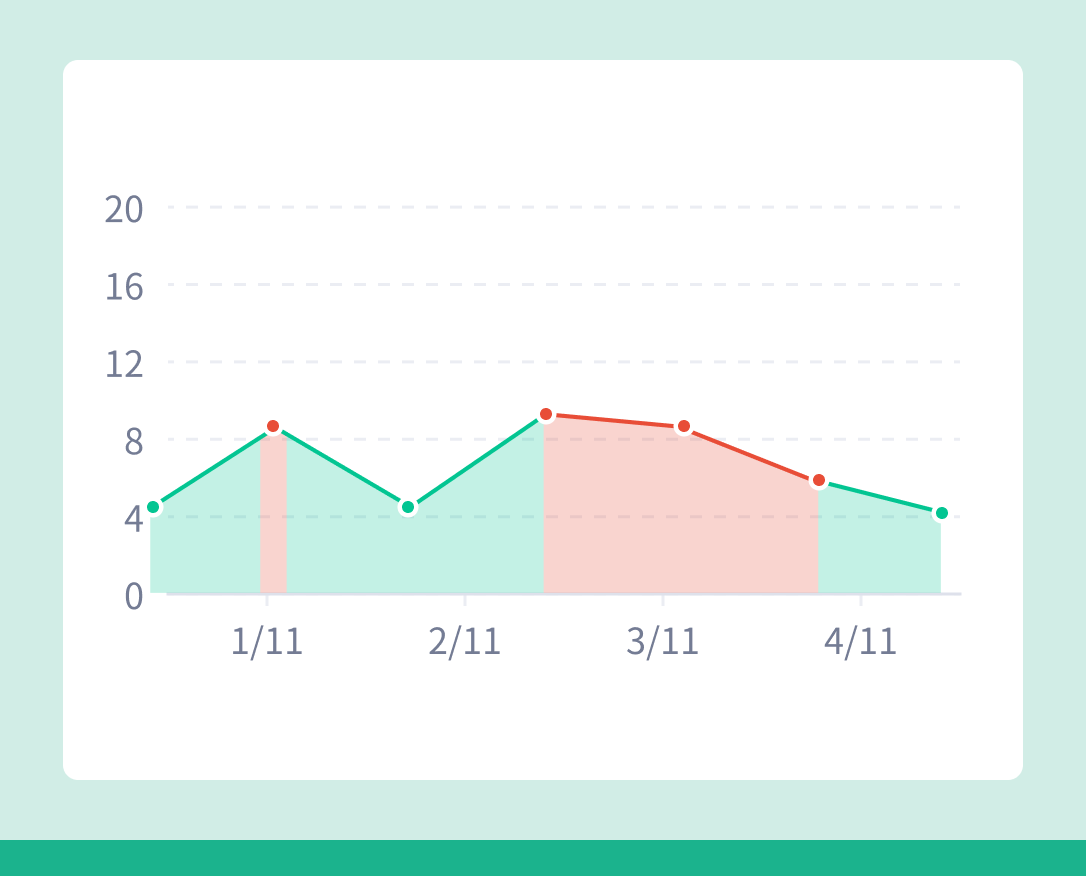
Don’t
Don’t use overlapped transparent area charts, as they draw attention to the lines instead of the actual values and reduce interpretability.
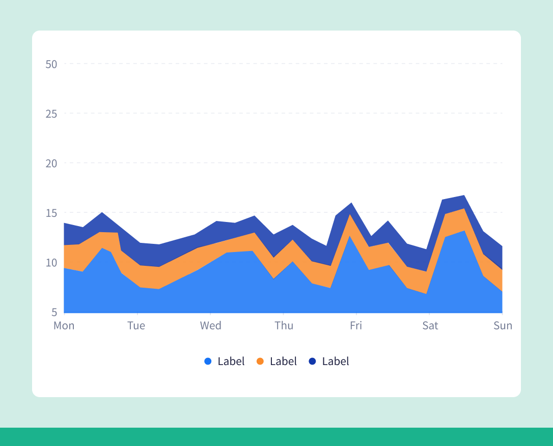
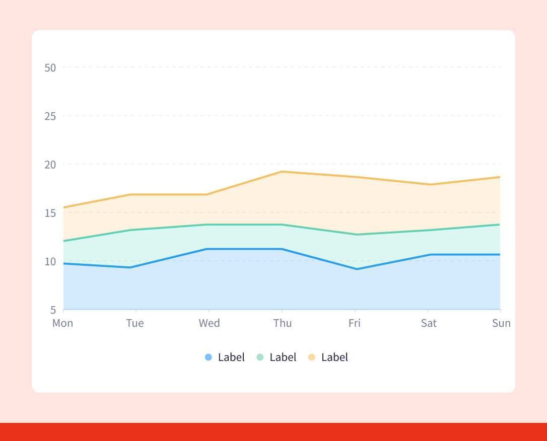
Do
Use solid stacked area charts to show each series clearly and provide a more accurate, easy-to-read view of the data.
Clarity
Ensure accuracy, clarity, and integrity in how data is presented, avoiding any form of distortion.
Don’t
Don’t use overlapped transparent area charts, as they draw attention to the lines instead of the actual values and reduce interpretability.
Do
Use solid stacked area charts to show each series clearly and provide a more accurate, easy-to-read view of the data.
Helpful
Design visualizations that support meaningful interpretation, helping users identify patterns, anomalies, and insights quickly and effectively.
Don’t
Avoid visuals that overwhelm users with unnecessary details.
Do
Use clean, focused chart designs that make key patterns easy to spot and help users draw insights more efficiently.
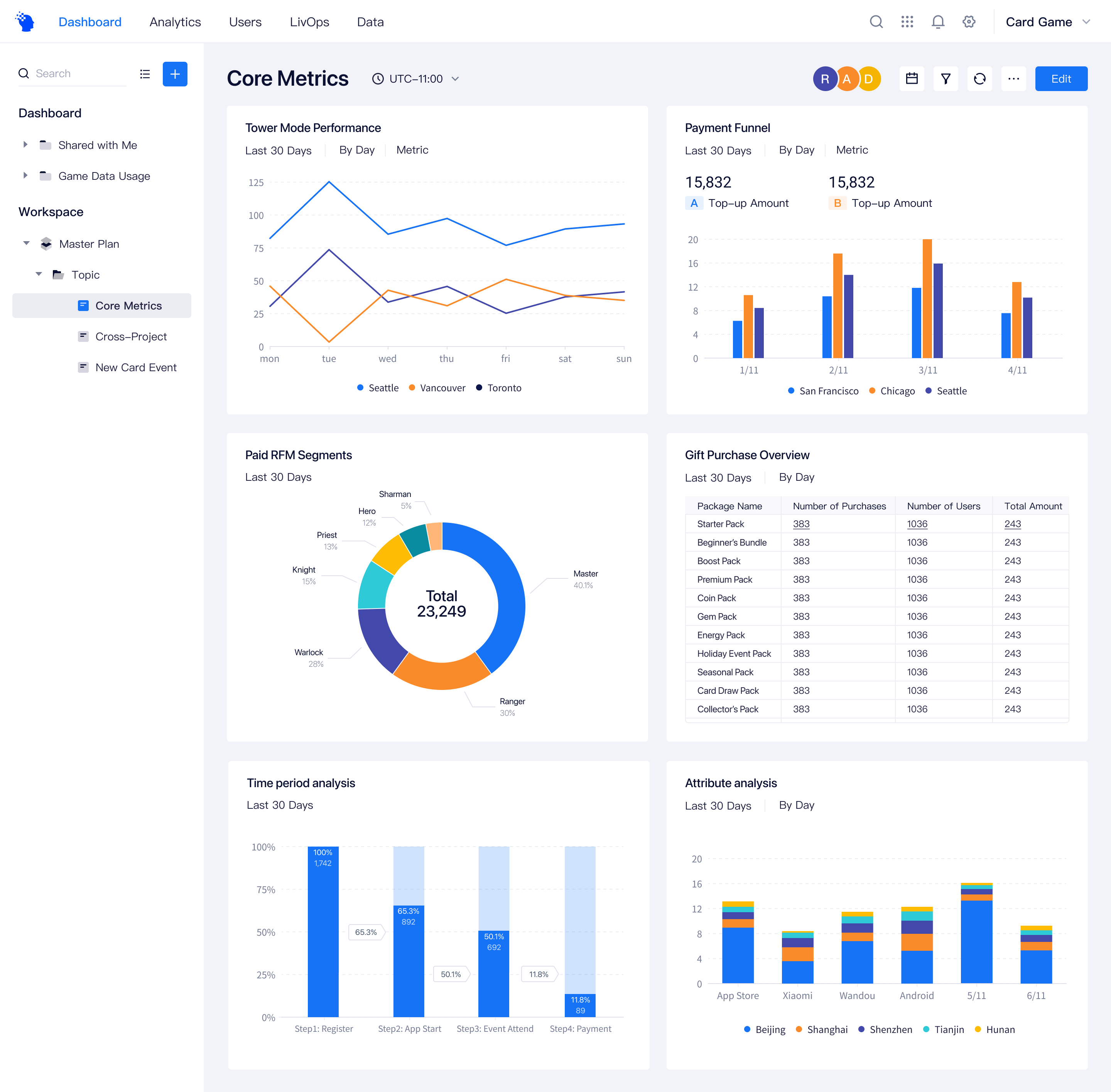
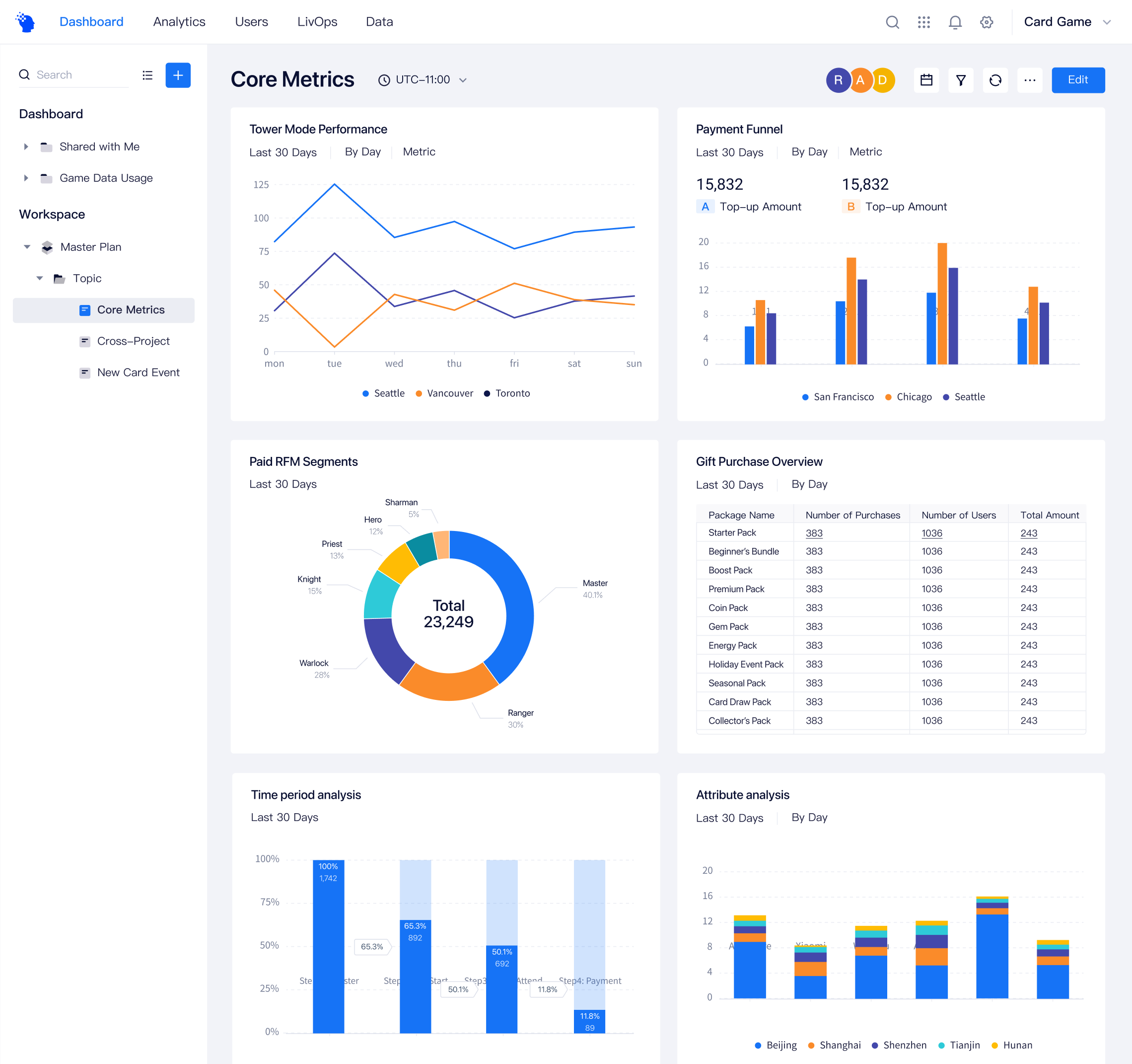
Before and after
The final design introduced a clearer and more consistent visualization system. The updated color palette improved contrast and readability, while standardized layouts reduced cognitive load.
Conclusion
Although the 4.0 iteration required significant effort, it provided a valuable opportunity for the team to gain a more holistic understanding of the product. It also allowed us to critically review and improve the structure and effectiveness of our internal design documentation. After the 4.0 release, the update not only received positive feedback from users, but also improved collaboration efficiency within the design team.