Redesigning Data Visualization
With the product becoming more complex over time, the existing design system was no longer enough to support a consistent and scalable experience.
As part of the 4.0 redesign, the team initiated a new design system, and I led the overhaul of the data visualization system while also contributing to core UI components.
The result was a clearer, more cohesive product experience that helped drive a 35% increase in user satisfaction and more positive client feedback.
Why Data Visualization Became a Priority
User feedback consistently pointed to problems in the data visualization experience. Combined with an audit of existing dashboards, this revealed three recurring issues:
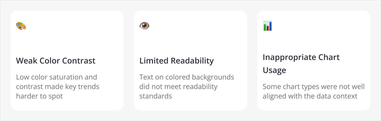
Insight: Poor visual hierarchy increases cognitive load. Instead of focusing on insights, users were spending too much time decoding the charts themselves.
Research
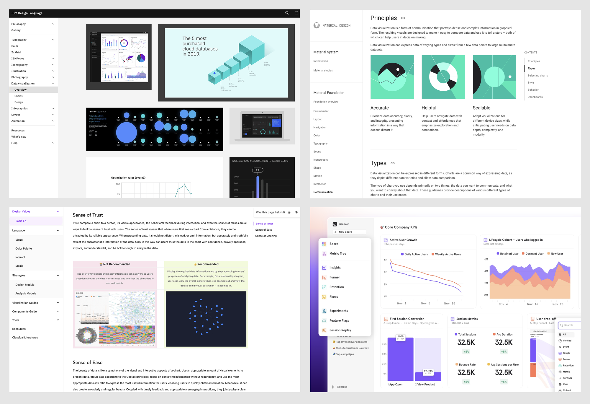
Before moving into design execution, I studied current visual design practices to better understand industry standards and emerging best practices. I reviewed some of the most established design systems and documentation, including Material Design, IBM Design System, and Ant Design, to identify principles that could improve clarity, accessibility, and consistency in data-heavy interfaces.
Design Process
With these issues identified, I approached the redesign from three angles: refining the color system, improving readability in dense data views, and aligning chart types more closely with analytical use cases.
Refining the Color System
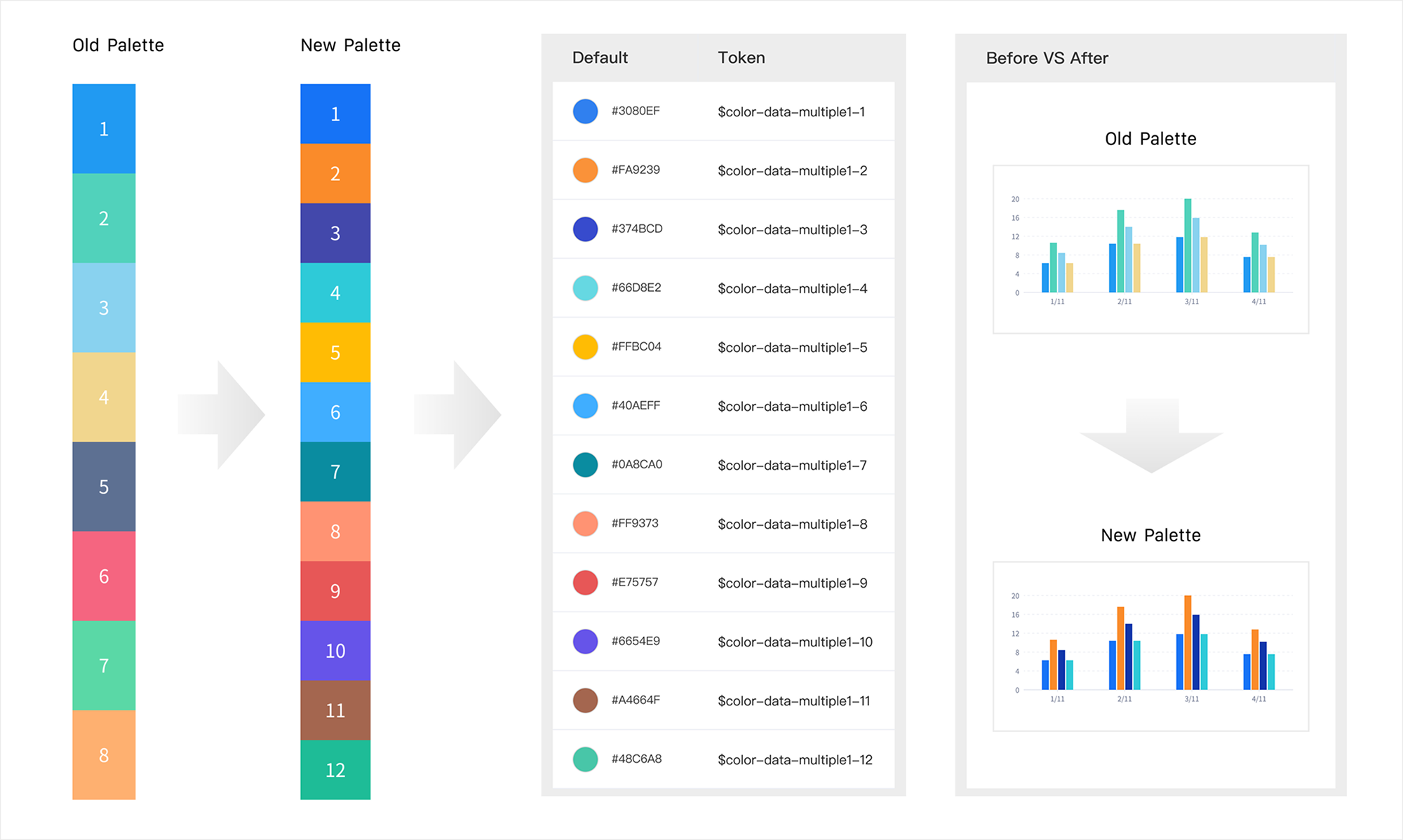
To improve the overall visual experience, I started with the most fundamental layer of the interface: the color palette.
After auditing the existing palette, I found that many of the original colors had relatively low saturation, which made charts feel visually dull and contributed to fatigue during extended analysis. In addition, adjacent colors often lacked sufficient contrast, making comparisons between data series less clear.
To address this, I refined the existing palette by increasing saturation and selecting color combinations with stronger contrast between neighboring hues. I also expanded the palette from 8 to 12 colors, allowing charts to support more categories while maintaining visual distinction and consistency.
Improving Readability in Dense Data Views
Beyond the overall palette, I also focused on improving readability in more information-dense scenarios, especially heatmaps.
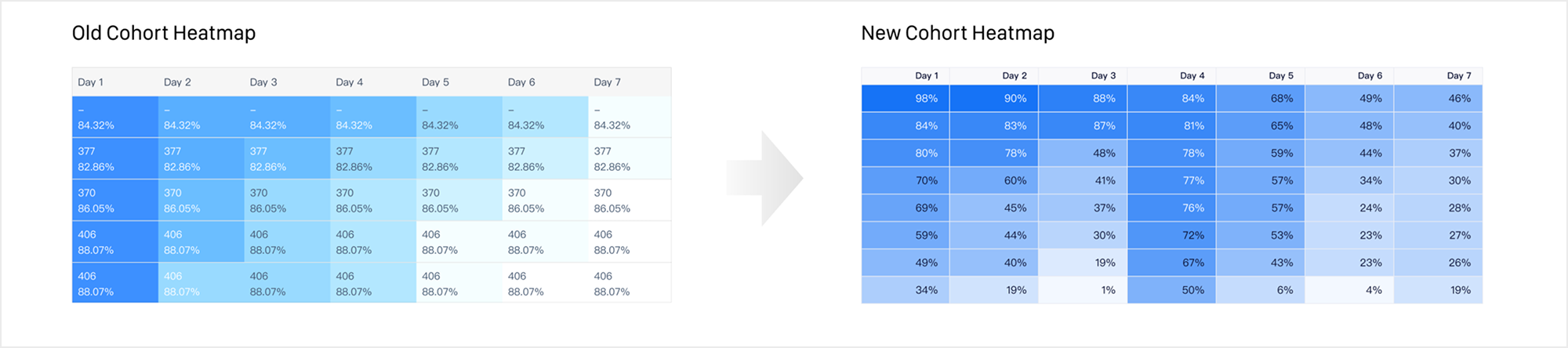
The original Cohort Heatmap used only 10 color steps, which made subtle value differences difficult to perceive in high-density views. Each step was manually selected by designers, so the progression between levels lacked consistency. In addition, the overall saturation was too low, and three of the levels had contrast ratios below 3:1, falling short of WCAG accessibility standards.
To improve both clarity and scalability, I redesigned the heatmap scale by increasing saturation and expanding it to 20 levels, allowing value differences to be represented more precisely. Instead of manually defining every color step, I introduced an algorithm-based opacity system that could generate consistent scales from a single base color.
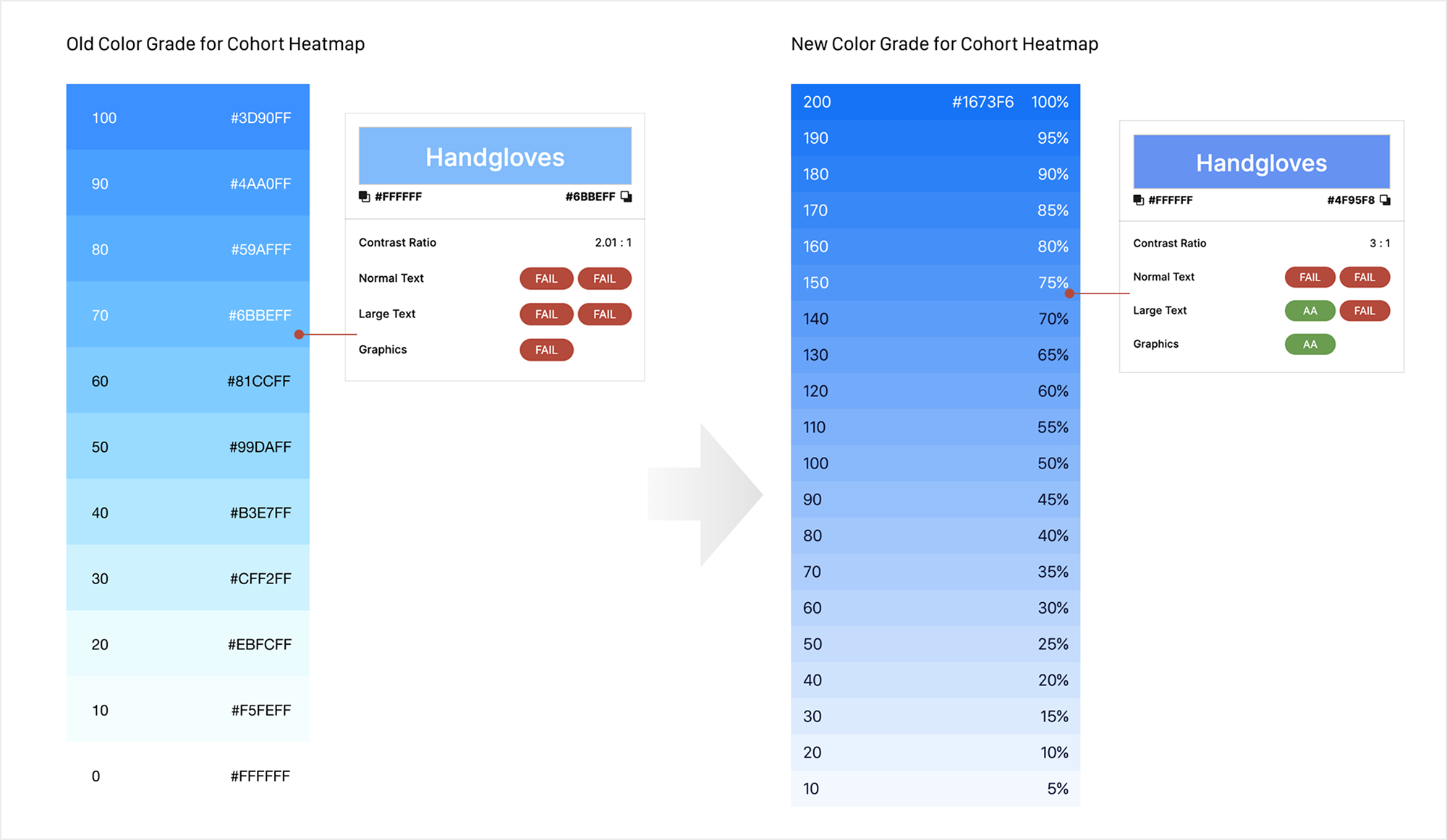
I also established a mapping rule that translated any value into a corresponding color level based on the minimum and maximum range within the visible dataset, making the system easier for engineers to implement and scale across scenarios.
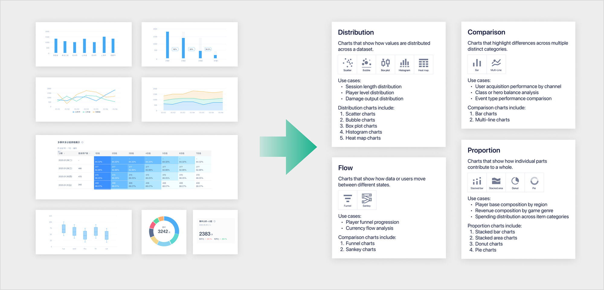
Aligning Charts with Analytical Contexts
In parallel, I reviewed all chart types used across the platform to ensure each visualization better matched its analytical purpose.
During this process, I found that our Stacked Area Chart was rendered as overlapping transparent area layers. In gaming analytics, stacked area charts are often used to analyze contribution trends across channels, event sources, or player segments over time. In these cases, users need to understand both the overall trend and the proportional contribution of each category.
However, the transparent overlapping treatment drew attention to the contour lines rather than the actual values and proportions, which reduced interpretability. To improve clarity, I redesigned the chart as a solid stacked area chart. This made the visual focus return to cumulative area and proportional distribution, helping users more accurately understand composition changes over time.
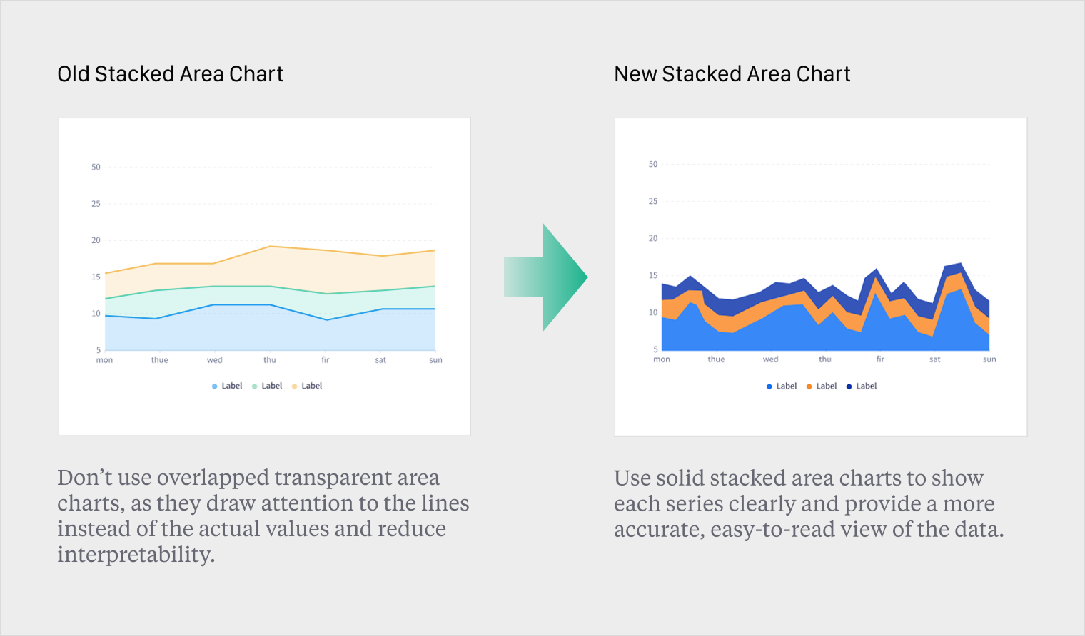
Before VS After
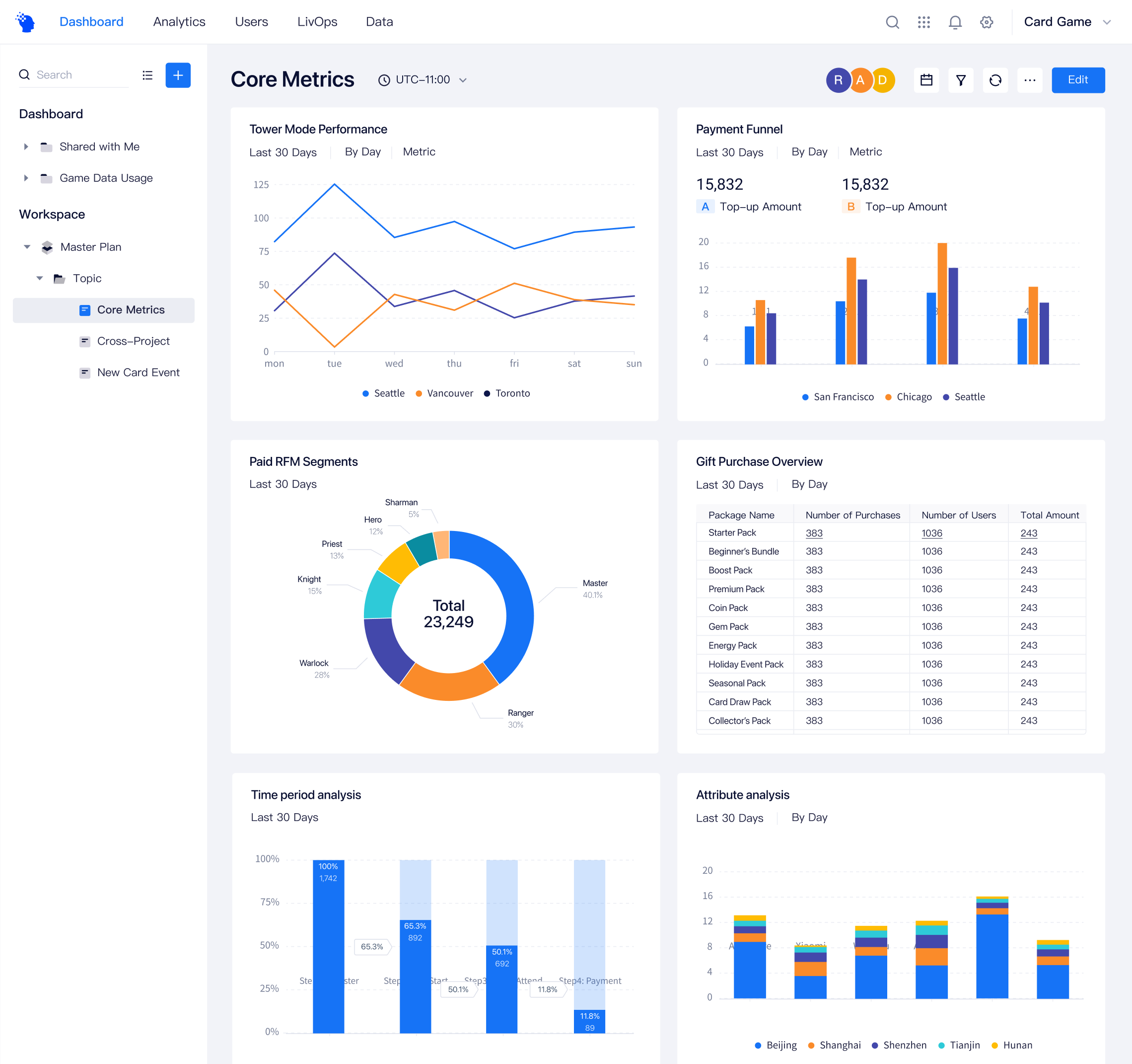
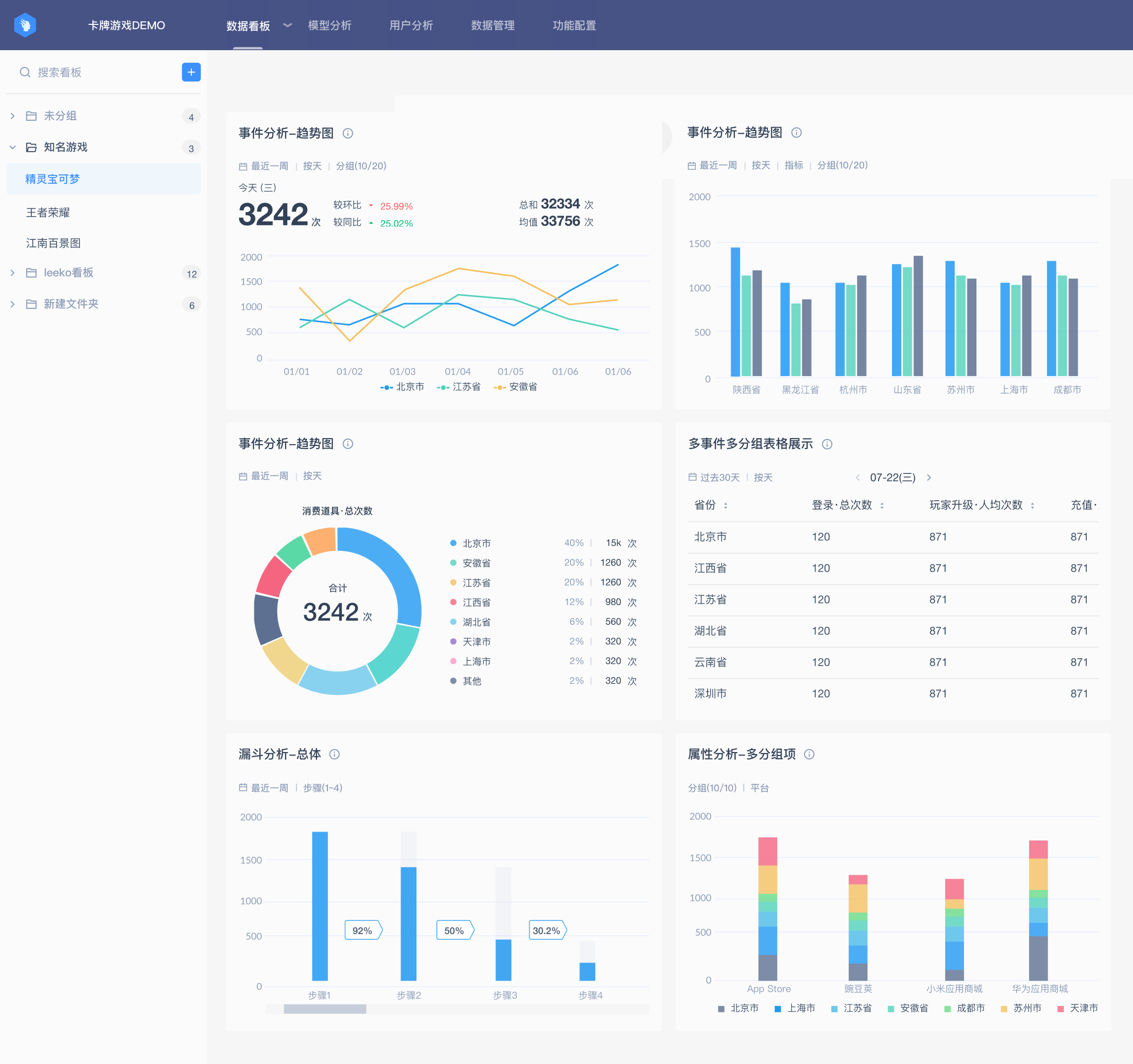
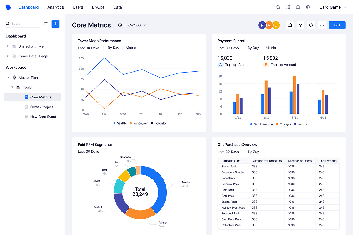
The final design introduced a clearer and more consistent visualization system. The updated color palette improved contrast and readability, while standardized layouts reduced cognitive load.